
 |
| 1971 Hermes 3000 7161835 |


Look at those strange, sharp shoulders. Who would have guessed such a rounded, innocent typeface could be contained within? I think Epoca was the first typewriter typeface I fell in love with, back in 2011 while reading Adwoa's blog. It took this long to pursue that love. Good thing I waited. ^^
Not typed by George W Bush on my new Hermes 3000
Very, very nice typeface -- I think it's my favorite sans-serif style.
ReplyDeleteAs for that '70s body ... hmmm ... stayin' alive!
I think the people at Hermes were kind of off in their own little world at times. XD I can see this fitting in perfectly with the early 70s Doctor Who futuristic-aesthetic.
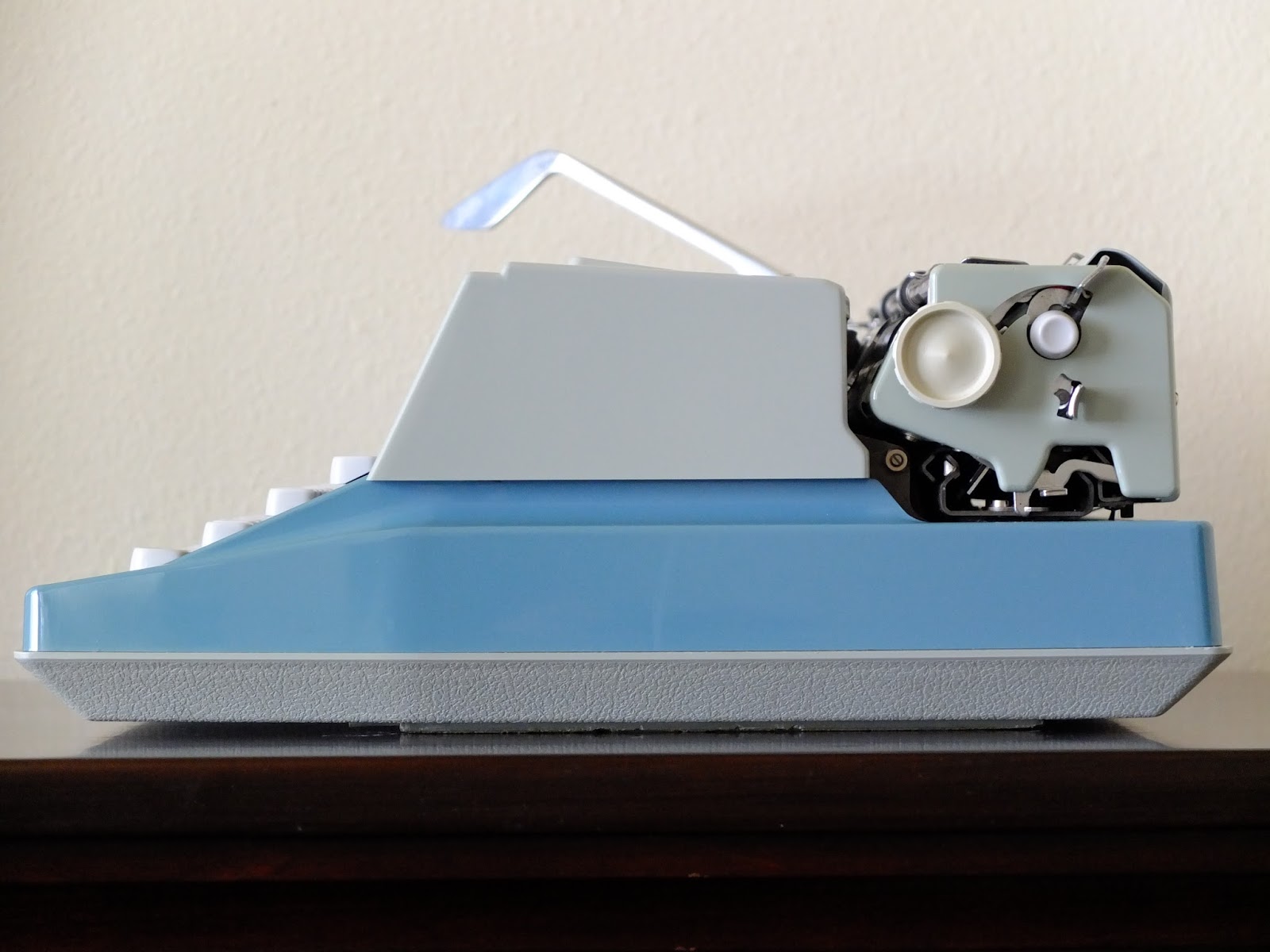
DeleteAnd I say good morning. Congratulations to this nice blue Hermes typer. This late (and last) Hermes 3000 variant came in two colours, the drab grey of course, and blue. I have only seen one more blue specimen in the last couple of years. You photographed them very nicely, and I share your impression that despite of the odd 70s design, it has got a certain something. If my memory serves me right (a blunt thing to suppose), most 70s Hermes 3000 I have tested have this, or a slightly different robotic typeface. I will dust mine on the week-end, and report. Happy typing!
ReplyDeleteI actually didn't realise that it the blue was that uncommon, as I'd seen it before and not thought much of it, being a 1970s machine. But going through eBay completed listings, I only saw one other and it had a Ukranian keyboard.
DeleteThere is a certain charm to it. It's very 'futuristic', yet accessible. Memorable nonetheless! As long as the quality is not significantly reduced, I'm just as fond of 70s typewriters as I am 50s ones. The styles are often looked down upon, but in 20 more years they will certainly be regarded in a more positive light.
Hi, almost 10 years later, I have a Hermes 3000 with Epoca myself. It is pure white. My other model seems to be greenish-grey, so it seems, there were three colors. Blue, white and greenish-grey.
DeleteGreetings to the typosphere!
www.typewriterrescue.com
Wow, this is gorgeous! I love how you have photographed it - if I did not know how angular and hulking these are in person, I would have been totally smitten... as it is your pictures are so good they make me rethink my disdain for the body style of this particular generation of Hermes 3000. (I've always been thankful I found my epoca on an earlier style, whew.) I think it's the blue - it's a beautiful shade and has aged well. Congratulations on finally finding an epoca - I hope other epoca admirers will follow your scheme to acquire one; it certainly worked well!
ReplyDeleteThe blue definitely is nicer than the grey, and I think the lines are strange enough to be rather endearing. They were trying pretty hard to look futuristic here, just like they did with the first generation 3000.
DeleteHopefully it works for somebody else!
Congratulations on the Epoca Hermes. That is perhaps my favorite Hermes type face. You are not alone in liking the plastic body 3000. Scott K. has a nice post on one on his blog.
ReplyDelete