Showing posts with label art. Show all posts

17 Jul 2015

Deep typewriter dreams


What in the world? What's happened to that beloved picture of Sholes liberating the women of the world that we all love so dearly?

DeepDream is one of those crazy and wonderful things that you had no idea would ever be created, but now that it has been, it seems like the most natural and essential thing. Google gets one more point on the love side of my love/hate opinion.

It's not my job to explain how or why. This SciShow video does a much better job at that. You should also look at this video which has been processed the same way.

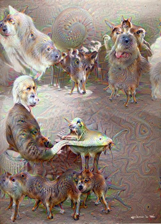
Anyway, the reason why there's dogs appearing everywhere is because the DeepDream system was tested out expensively on recognizing dogs in images. So any time something in an image looks a bit like a dog to DeepDream, it draws us a dog there.

 
DeepDream isn't only useful for creating trippy dog-laden images, though. It can also be used to create some really lovely artistic effects better than any Photoshop filter ever could.


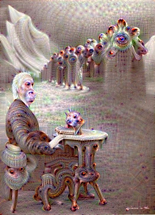
This classic Sholes image turned out to be very good fuel for DeepDream's interesting effects.


I created all of the images in this post using Dreamscope.  The output quality is unfortunately not that great, but this service creates them in a matter of seconds, rather than others which have queues that are over 24 hours long.

I also have tried it out on a couple typewriters of mine.


I have to say, the "trippy" effect has to be my favorite one. It's just so weird. And unpredictable, at first, until you start to recognize what cues tend to bring out the weird.


This is supposed to be a little child typing at an Erika 10.


This is created from what has to be my favorite ebay listing image for a typewriter ever.


Sometimes the artistic effects are really quite beautiful and turn out works of art.


And sometimes you just.... I don't know. I have no idea. But I love it.

Create your own.

30 Jun 2015

Mapmaking

Earlier this month, I posted on the map I created from the sketch I made while spending the afternoon outside. While those outside activities have had to be curtailed due to a stretch of uncomfortably hot weather (to anybody from the south this is going to sound silly, but it's been in the mid-80s [~30°C] for the past 2 weeks) I've continued creating maps of places both fictional and real.


This was done in black pen on a 5" x 8" Rhodia pad. It's some of the best paper for fine pen work, though if you're sloppy, it can sometimes smear a little. I scanned it in and colored it digitally to simulate a 3-color printing process. The area is loosely based on northwestern Michigan.


This map was created in the same way as the previous one, except it was based on central Nova Scotia. I used Sakura Micron pens for these two. Click to enlarge.


And this is a full-color (9 colors, to be exact) map of southwest Michigan, done with Sakura Micron (black) and Marvy Le Pen (colors). It's accurate for driving with and nothing on it is fictional, unlike with the others. Errors are therefore less forgiving because I can't just imagine a road or a differently-named city.


This gif shows the process of creating a black and white map of a fictional place.

1. Sketched out the coastline and major cities, and connected those with main roads and added small towns and county borders.
2. Added minor roads and sketched the names for major cities. Added highway shields to main roads.
3. Inked main roads and highway shields, adding road numbers.
4. Inked major city names and filled in the main road patterns denoting highway surface. (you'll notice here that I smeared the ink on the highway above White Cloud, the first error I made)
5. Inked small town names, then the coastline and water features. (my second mistake was inking a minor road near White Cloud as a river)
6. Added decorative lines to coastline and lakes, and inked county lines. Fixed both mistakes by turning the smudge into a minor road and re-routing the river. (this is why I like creating fictional maps based on reality rather than maps of real places!)
7. Inked minor roads, added hills, and added compass and title. Erased pencil sketch.
8. Scanned and colored digitally.


I just got this new old stock Berol RapiDesign general mapping stencil which will help out a lot!

3 Feb 2014

More scrawling from my hand

The designs made by blowing on a blotch of ink on paper remind me of highways radiating from a large city.


I forgot to mention that I was having trouble with my Zebra stainless steel ballpoint skipping, as well as just about every other ballpoint pen I use, which partly prompted me to buy a blue extra-fine point Lamy Safari. The other reason was I wanted a more practical way to write in style than my dip pen. Which is not practical at all.

My writing is much less sloppy with a felt tip pen though. It actually looks rather consistent and nice. But still not as fun… hopefully a fountain pen will meet somewhere between the two.

Pencast with my Hunt nib and Daniel Smith walnut ink.

30 Dec 2013

Stencil time


Thought I'd share some of the non-typewritery things I've been working on the past few days. These are some pretty crude examples, but they are my first two attempts. I'm learning as I go and the next ones I make will definitely be better. Lots of fun. :)


The Tacoma one was my second attempt though it looks cruder than the first, "дирижабль". I forgot to leave connections for the insides of the a and o, and I didn't paint it very evenly either.


My little addition to the sanctioned graffiti garages on Broadway:


I have another purpose for these stencils which will be revealed in time, part of a larger project!

5 Jun 2013

Typosphere III (Poster 4)

Typosphere III featuring Facit 1620

I'm not sure what images this conjures in my mind. I'm thinking of both evil computers and green monsters?

3 Jun 2013

31 May 2013

Typosphere III (Poster 2)

Typosphere III featuring Imperial De Luxe 5
Seems like this is a bit of a thing for me now. It's a lot of fun and good practice.


29 May 2013

Typosphere III (Poster 1)

Typosphere III featuring Hermes 2000

The third year of Philosophothought and the typosphere proper deserves a poster, I should say.
My design, hereby released to everybody for free to use and abuse, etc.