 |
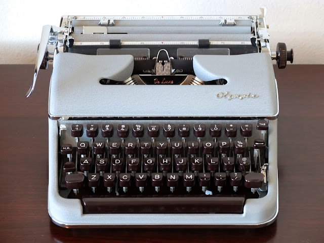
| 1957 Olympia SM3 De Luxe 1048584 |
My favorite dealer decal ever! And positioned nicely, too. On the back so I only have to look at it if I want to. This spent its whole life in Long Beach until it reached me.
I should say that my comment about italic typefaces isn't completely correct. Italic, as handwriting, was first used to save space. It continued that in it's typeface form until it became used for emphasis only. Also, the other obvious reason I have so many--because they're amazing to use!
Sent from my new Olympia SM3 with Pica Italic


Beautiful. It cleaned up great and has a fine typeface.
ReplyDeleteI am currently working on a burgundy SM3 for WordPlay. It wasn't well taken care of -- bent paper support, type all filled up, spots and dirt and hair and erasures on the poor thing. But it types! These things were made to the highest standards.
It's amazing what you can do in an evening if you put your mind to it.
DeleteYou might remember my first SM3--the one with Henry Guikema riveted on the ribbon cover. Well, his name and church at least. And I can say the same about it as I can about the one you're working on!
Very nice typeface. I'm still waiting for a reasonably-priced good condition one to pop up (I won't hold my breath) so I can bid on it. I have a habit of being out-bid on eBay, but then I know my limit and usually stick to it. :)
ReplyDeleteIt will be worth the wait. :)
Delete-from a chronic out-bidded eBayer. (or else they just go way out of my reach with two days left…)
Very nice SM3. Congratulations. It looks to be the same color as the one I have. I understand having more than one. After using mine I have been searching for more. Very nice typewriters.
ReplyDeleteScrubbing success!
ReplyDeleteLove the SM3s too, although I only have one so far. Really nice clean-up.
ReplyDeleteHUZZAH! LONG LIVE THE SM'S!
ReplyDeleteGood job cleaning up too! ;)
The SM3 is probably my all-time favorite portable. I understand what you mean about waiting. I jumped on an SM3 that I was sure I could fix easily, but the letters don't line up properly, so all of my manuscripts with that one are slightly awkward to read. I love using my burgundy one (italic font) for personal letters.
ReplyDelete