30 Oct 2013

Tbilisi, Georgia

The Presidential Palace neighborhood posesses some interesting contrast

Abandoned buildings amongst the occupied but deteriorating residences

Hotel for $30 per night including (almost always) running water

A quiet street

Kardanakhi Turn


Not as much contrast, but it's still there

"41" was the winning candidate of the October presidential election

One drab, deteriorating complex after another

Yet, they are very well designed, and must have been excellent when new


Our building on Zakaraidze Str

From the 7th floor

Over the years each flat has been altered by its residents

From ground level

One of the numerous exterior stairwells with semi-enclosed lifts


When I mention the consistent failure of American cities, I am referring to the ones I am familiar with. I know there are very good metro/subway/underground systems there, but I've never had the advantage to experience one firsthand.

Sent from my Olivetti Lettera 22

24 Oct 2013

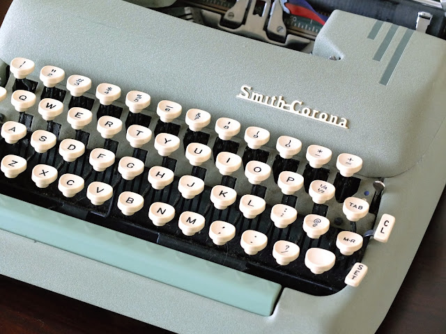
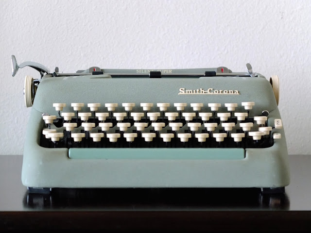
Smith-Corona Script of Vertical Nature

1956 Smith-Corona Silent-Super 5T370396


Turn your head upside-down.
The script kinda looks like Georgian when you look at it that way...such fate. What fate.

Sent from my new Smith-Corona Silent-Super

23 Oct 2013

Who Is Jolson Alma?

195X Jolson Alma (No Serial #)


Pardon that ignorant grammar error in ¶5!


The platen on this is very wide for an ultraportable; wider than on a Smith-Corona Super Silent at least.

Sent from my new Jolson Alma (Antares) in memory of James K Polk.

22 Oct 2013

An Adventure Begins


I've never been keenly interested in the smallest portables, so I don't have a large range to choose from, and I don't own some of the better machines in that size class. I'm thinking about taking my Alma Jolson branded Antares. Incidentally, I haven't had a chance to feature that (might fairly soon) but Mr Messenger just mentioned Mr Polt's on his latest blog post. I hadn't been aware of any Alma Jolson's other than mine until today. :)

Sent from my Olympia SM3.

18 Oct 2013

A Torpedo's Change of Clothes


All four of these pictures are the same typewriter; my all ivory Torpedo 18b with Esquire type. One of the beautiful advantages of Torpedo's colour schemes is that you can mix and match as you please, creating seemingly endless combinations just by switching the ribbon covers. Of course, a lot of these look pretty gross, but here are four that I find to be very pleasant. Right now I've got the blue ribbon cover on it, and I think that's my favourite.


Three of the ribbon covers here belong to typewriters I've already featured in the past, but the green one is new. The amazing all green Torpedo seen below was part of a trade with my good friend Andrew when he visited last month. I exchanged my silvery green-grey script Torpedo for this. It's imperfect, though. The "R" typeface is loose on the typebar. Thankfully it is ordinary elite, which seems to be the most common typeface on Torpedo 18s so I'll be able to replace it eventually if I can't solder it back on.  Doesn't stop it from being one of the most beautiful colour schemes Torpedo ever made!


16 Oct 2013

Micro Diamond Olympia (Mystery No More)

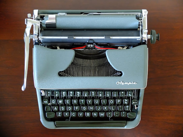
1958 Olympia SM3 1137181


Apparently as soon as I convince myself I've found the ultimate XYZ typewriter, I find the real perfect one...how about that?

I think this has a slightly more elegant feel to it, especially from the rear due to its lower profile, than the De Luxe version. Of course, I could just be blinded by the incredibly intact chrome and crinkle paint!

Sent from my new Micro Diamond Olympia SM3