13 Nov 2013

Soviet graphic design through road atlases

1960 / matte hardcover


1967 / matte hardcover

1970 / textured hardcover

1971 / textured flexible hardcover

1974 / textured hardcover

1974 / textured hardcover

As you can see, there were many different designs (this is only a small sampling) with at least 9 known covers (likely a few others exist) for 1974 alone. The interiors change also, as the actual maps are redesigned, but there are also two different internal layouts. As this is predominantly a typewriter blog, I won't go into too much nerdy detail at first but if anybody else is curious I could certainly examine one of these atlases in detail and compare it to others.

1974 / glossy hardcover

1974 / glossy hardcover

1974 / textured hardcover

1974 / textured hardcover

1979 / textured hardcover

1979 / vinyl softcover

It's interesting to see the incredible variety of atlases produced from the one central organization. I am aware of at least 6 binding types. Matte hardcover, textured hardcover, textured flexible hardcover, glossy hardcover, glossy softcover, and vinyl softcover. It's also fascinating to see the different styles of graphic design that prevailed in the Soviet Union over 32 years. I find that, for the most part, they all were designed in very good taste, if at first a little strange to our western eyes. (I know I have readers from more than just the west, but I think I could say the vast majority of responsive readers are located in western cultures.) Their style is very "graphic"—simple and striking.

1982 / glossy softcover

1984 / textured flexible hardcover

1991 / glossy hardcover

1991 / glossy hardcover

You can see our Atlas of Automobile Roads USSR collection in its entirety on my Roads & Maps website. That is, of course, constantly changing and is in a bit of a state of disrepair as my descriptions of atlases are a bit lacking at this point. Cover and map scans, though, are very up-to-date.

These eastern European road atlases aren't really documented much at all, as far as I know. There certainly is no good source for information about them in English. I'm striving to create a good resource on my website. At this point, we own approximately one-fifth of the known cover variations of the Atlas of Automobile Roads USSR / Атлас автомобильных дорог СССР / Atlas Avtomobilnikh Dorog SSSR. (There are 90 known variations made from 1959 to 1991, including same covers with different publication years, not 60 as I said in the typecast.)

Sent from my travelling Olivetti Lettera 22

11 Nov 2013

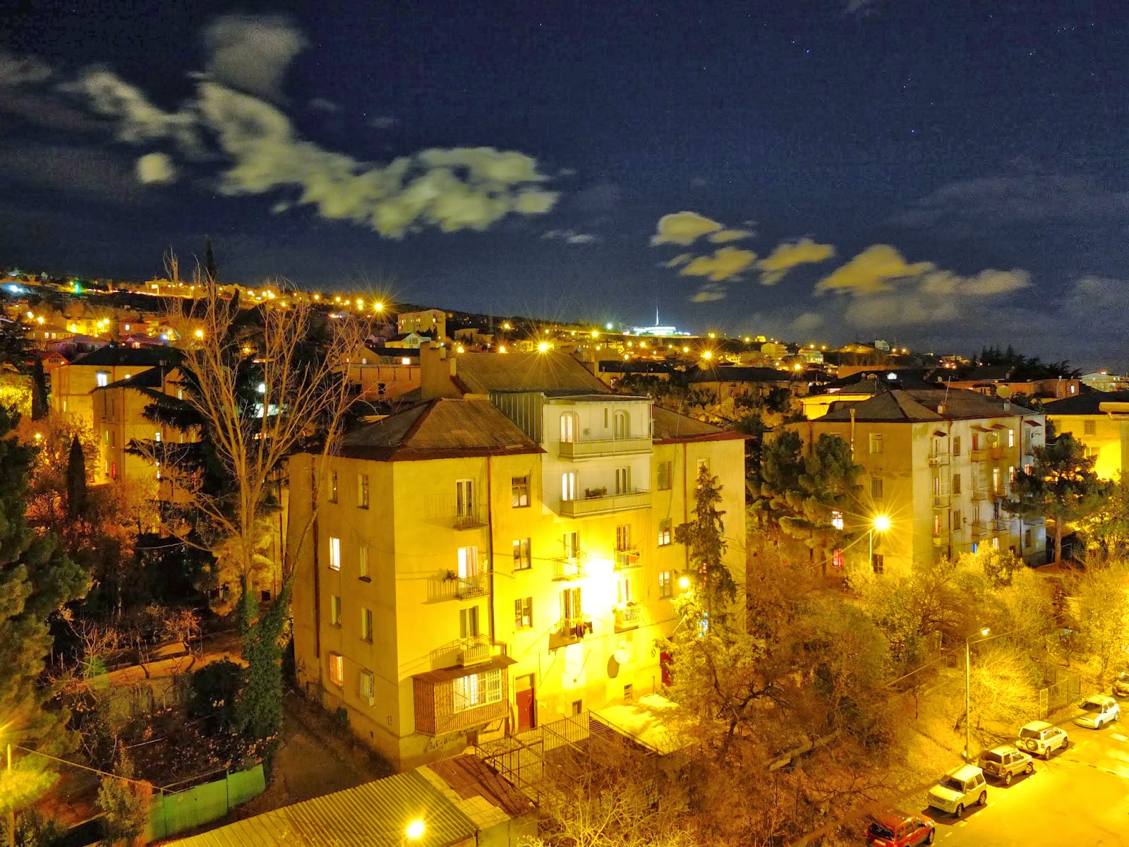
Learning Russian / Tbilisi at Night / Metro


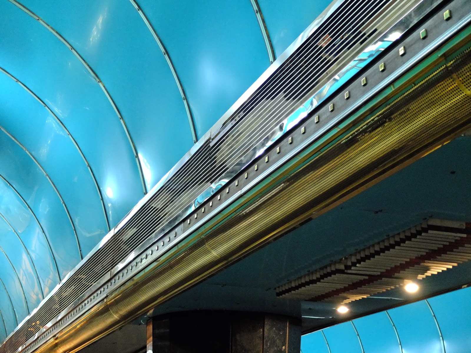
I've also decided to show some photos of my favorite Metro stations to supplement the previous post. Rustaveli station definitely has the nicest exterior with its concrete mural. There is always one and only one door open in each direction at every Metro station and you must always go through that open door and never open any other. Apparently that's an unwritten Georgian law.


The Technical Institute station has the nicest interior design, I think, and is better-lit than most stations. It is all grey, but the ceiling provides its own contrast. It also directs attention to the mosaic-mural.


Finally, Tsarateli station certainly has the most vivid use of color. It's darker inside than my photos indicate, but I felt like editing them to show how it would look if properly lit. Many of the other stations are less interesting and even more poorly lit, but these show off the best of Tbilisi Metro. The best-designed stations seem to have been built in the 1970s.


A side note about police in Georgia. Apparently this country used to be pretty unsafe and the police were unreliable and generally useless. Now the nicest buildings in all of the small towns are police stations, and in Tbilisi they get quite grandiose. It is said that the all-glass walls symbolizes police transparency, but you might notice that half of the panels have walls behind them. XD


Sent from my Olivetti Lettera 22

5 Nov 2013

Tbilisi Metro

A train enters the station

The arch creates a strong roof for the deep stations

Some stations still sport Soviet-era signage in Russian, such as Delisi


Delisi station

The front has been upgraded but the train is old

Redecorated in Georgian colours

The old traincar numbers are beautiful

Inside an empty late-night traincar


Inside Station Square

Waiting to board the next train in Station Square

Each stop has its own unique style

Escalators are often provided to save climbing hundreds of steps

The Metro can be entered through underground crosswalks such as these (English graffiti here can get quite silly!)

Usually with the "M" sign but sometimes missing

Or at ground-level entrances such as this

I've started a tumblr blog entitled "мы из будущего", or, "we are from the future" inspired by the name of the Soviet Russian television programme named as such (not the modern film). In it I post various photos and scans of items of interest from the USSR. Some of these will be shown on Philosophothought, but much won't make it this far. This accompanies my other tumblr blog X Over It (and similarly named youtube channel, still with only one video though) which is about typewriters and mostly duplicates information from Philosophothought.

Sent from my Olivetti Lettera 22